Sunday, September 30, 2018

Fidget Cube: The Product We Didn't Know We Needed

The idea for this article came to me while I was sitting in a two-and-a-half hour class, fiddling with my Fidget Cube. The Fidget Cube is a small six-sided device, and each side has a different stimulus: buttons to click, a joystick to move, gears to roll, a switch to flip, a dial to spin, and a flat side with an oval indent to encourage mindfulness. The object of one of the most successful Kickstarter campaigns in history, the Fidget Cube became a sensation amongst fidgety people. How did such a small cube capture the public’s attention? It all began with two brothers, a small company, and an Internet campaign.


All six sides of the Fidget Cube
I stumbled upon the Fidget Cube while scrolling through Facebook, where popular site NowThis posted a video about it. Being an avid cuticle-picker myself, I had to get my hands on one. It is small and relatively quiet to use, so I can fidget without disturbing those around me. This was the goal of brothers Matthew and Mark McLachlan: to create a device for all ages that would provide a stimulus for all those fidgeters out there. In an interview with AdWeek, the brothers noted that they are extremely antsy when they work. “We checked out what tools were available for fidgeting, and we couldn't find any that we'd feel truly comfortable using in a professional setting. In terms of form, most were brightly colored and clearly marketed solely to children,” they claimed. Thus was born the idea for the Fidget Cube.
Matthew and Mark McLachlan


Matthew and Mark McLachlan have been inventors since a young age. Both brothers enjoyed creating new things, but they always had a mental block, thinking that they would never be able to actually implement the ideas they conjured up. In 2015, Matthew and Mark challenged that idea and founded Antsy Labs, a company dedicated to fidgeting. When the brothers decided to begin the Fidget Cube campaign, they were unsure of what the response would be. Before launching, when they explained the concept to people, nobody seemed to understand it. However, when they posted their product on Kickstarter, a website dedicated to helping entrepreneurs raise funds for new inventions, the campaign racked up $6,465,690 in donations to fund production of the Fidget Cube.


Spider-Man Fidget Cube!
So what made the Fidget Cube different? In my opinion, the cube is something that many people needed but didn’t know it. That is where the creativity of the McLachlan brothers lies. In Creating Minds, author Howard Gardner notes that while solving problems is a key part of creativity, it is the ability to fashion new products and identify new problems that marks a true creative mind. Matthew and Mark did not just look to solve the problems of the people; they identified a new problem: fidgeting. By bringing an issue to the forefront that many people didn’t even know they had, the brothers exhibited their true creativity. They were able to channel that creativity into a product that was unlike anything else on the market. And while the sheer talent of the McLachlans and the novelty of the product played a large role in the creative process, the product could not have been successful without people. Without the 154,926 backers that donated to the McLachlan brothers on Kickstarter, the Fidget Cube would have remained only an idea.


So what’s next for these innovative individuals?  “We both are continually discussing the dozens of ideas we have in our sketchbooks. Even if we launched one or two of them each year, I'm not sure we'd ever run out with how quickly we add new ones to the list,” said the brothers. If you’re like me and can’t stop moving those hands, check out Antsy Labs. A Fidget Cube may just be what you’ve been looking for.


Sources:
Forbes Magazine
Adweek
Kickstarter.com
Antsy Labs
https://www.antsylabs.com/
Creating Minds: An Anatomy of Creativity Seen Through the Lives of Freud, Einstein, Picasso, Stravinsky, Eliot, Graham, and Gandhi, by Howard Gardner

Thursday, September 27, 2018

"Everything I Saw Became Something to be Made": Ellsworth Kelly's Worldview


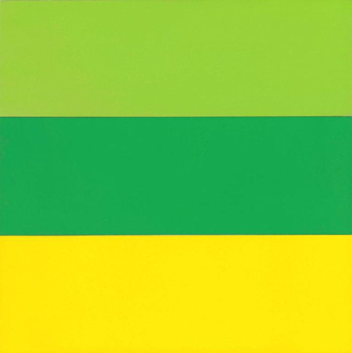
Ellsworth Kelly, born in 1923, was an American artist who was active first in France and, later, in the U.S. until his death in 2015. He is best known for his straightforward, highly abstracted paintings consisting of solid colors and multiple canvases. Kelly’s work is moving because of its vivid simplicity and large scale—his paintings easily envelops the viewer. Taking a step towards the painting, reading the title, and taking two steps back changes the viewer’s experience of the work from abstract to concrete, but makes the experience no less immersive. The work itself has not changed, but by learning what subject Kelly had translated to create the work, a new layer of significance is added, and the work is transformed in the eye of the viewer. I first had this experience with Spectrum II (1966-1967, above) at the St. Louis Art Museum, paintings are both transformative for the viewer and an experience based on the transformations that occur while viewing, and reflect Kelly’s creative philosophy of existence and art, of a visual world that is just waiting to be transformed.
           
In Ellsworth Kelly: Catalogue RaisonnĂ© of Paintings, Reliefs, and Sculpture, Volume One, 1940–1953, compiled by Yve Alain Bois, Kelly explained, “Everywhere I looked, everything I saw became something to be made, and it had to be made exactly as it was.” Kelly’s partner, Jack Shear, further explained Kelly’s creative outlook: “If you turn off the mind and look only with the eyes ultimately everything becomes abstract."


The painting above is a work by Ellsworth Kelly I’ve visited many times at the Art Institute of Chicago. The painting is nearly four feet by four feet, a perfect square. The colors are solid, vibrant, and matte. As displayed at the Art Institute, it’s on a white wall, with a small plaque near the bottom right corner, too small to read if viewed from far enough away to appreciate the painting as a whole work. You approach the painting from across the room, drawn to it by the bright, well-matched colors, symmetry, and overall starkness. Maybe the brightness of the yellow is what caught your eye, or the striking quality of the darker green between the two lighter colors, or the wonder of the geometric perfection of the canvas—is it one or three pieces, you wonder? (When you step closer, you see it’s made of three joined canvas panels—one per color.) Nevertheless, the scale and color of Train Landscape has drawn you over, and you stand at a distance, marveling at the technical perfection. You project your own experiences and interpretations onto it—when I saw it, I thought, “wow, that’s my favorite shade of yellow… it reminds me of a summer day at the farm, looking at the sunflowers.”
After contemplating the painting in the context of your own experience, you step forward to read the plaque at the bottom right. “Ellsworth Kelly, American, 1923-2015. Train Landscape, 1953. Oil on canvas; three joined panels. 11.8 x 111.8 cm (44 x 44 in.) Collection of the artist, 73.2004,” the plaque notes, and explains that this was Kelly’s view from of the countryside through the window of a train, with the colors from fields of corn and soybeans blurring together thanks to the speed at which he was traveling. You step back again, look at the panels through your newfound lens of a speeding train window, see the fields of corn and soybeans rushing past, and move on to the next work of art. Whether or not you realized it, your viewing of Train Landscape was a reverse-engineering of Kelly’s creative process in making it.
Kelly’s process involved seeing the world through eyes unclouded by extraneous meaning and translating what he saw as reality into a reality others could see as well. By seeing the colors and shapes of his work first, and what they are second, we see Kelly’s reality in the purest possible sense.
For more on Ellsworth Kelly's process and life, as well as interviews, please see his interview with The Guardian shortly before his death, and "'Exactly As it Was': Ellsworth Kelly's Basic Training" by Tim Keane. Several works are also on display at The Art Institute of Chicago, including Train Landscape