In October 2021, I went on a first date to the Art Institute. We wandered around and eventually made our way to the ‘temporary exhibit’ section of the museum. The art was loud and flashy, using shades of black, grey, white, and red, and most of all, it sent a message. It was personal and intimate, using personal pronouns that drew me into the art. Looking for a title, a creator, anything, I found the name of the artist: Barbara Kruger. I needed to know more.
Born in 1945, Barbara Kruger grew up in what is called the “Golden Age of American Advertising”. This era started in the 40s and spanned past the 60s, as marketing began to get personal, creative, and avant-garde. Target audiences shifted from adults to young adults, and companies began to rebrand themselves.
Barbara began her journey into art in 1964 when she began studying at the Art School at Syracuse University, and then in 1965 at the Parsons School of Design. She studied under noteworthy and influential artists Diane Arbus and Marvin Israel. Before finding her niche, she worked in weaving and painting. But in these mediums, she felt stuck. It didn’t align with her personal identity; it didn’t feel like herself.
In 1979, Barbara began experimenting with photos, text overlays, and colleges. She began overlaying text onto older, repurposed images. This is where she began the type of art she makes today. Her fonts of choice are either Futura Bold or Helvetica Extra Bold in red, white, or black, on a background of red, white, or black. She puts this text onto images that are used in mass media and are often recognizable to individuals who are not trained in art, for example, Marilyn Monroe.
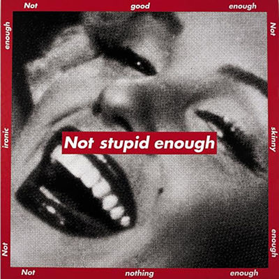
Her art directly addresses the viewer, catching their eye, and calling them out. Her favorite themes are concepts of war, politics, gender, consumerism, violence, sexuality, and identity. She uses examples of advertising that she witnesses growing up as a reference, creating a more ‘realistic’ advertisement: humanity. She often times challenges expectations and authority figures, while simultaneously acting as a voice of expectations and authority.

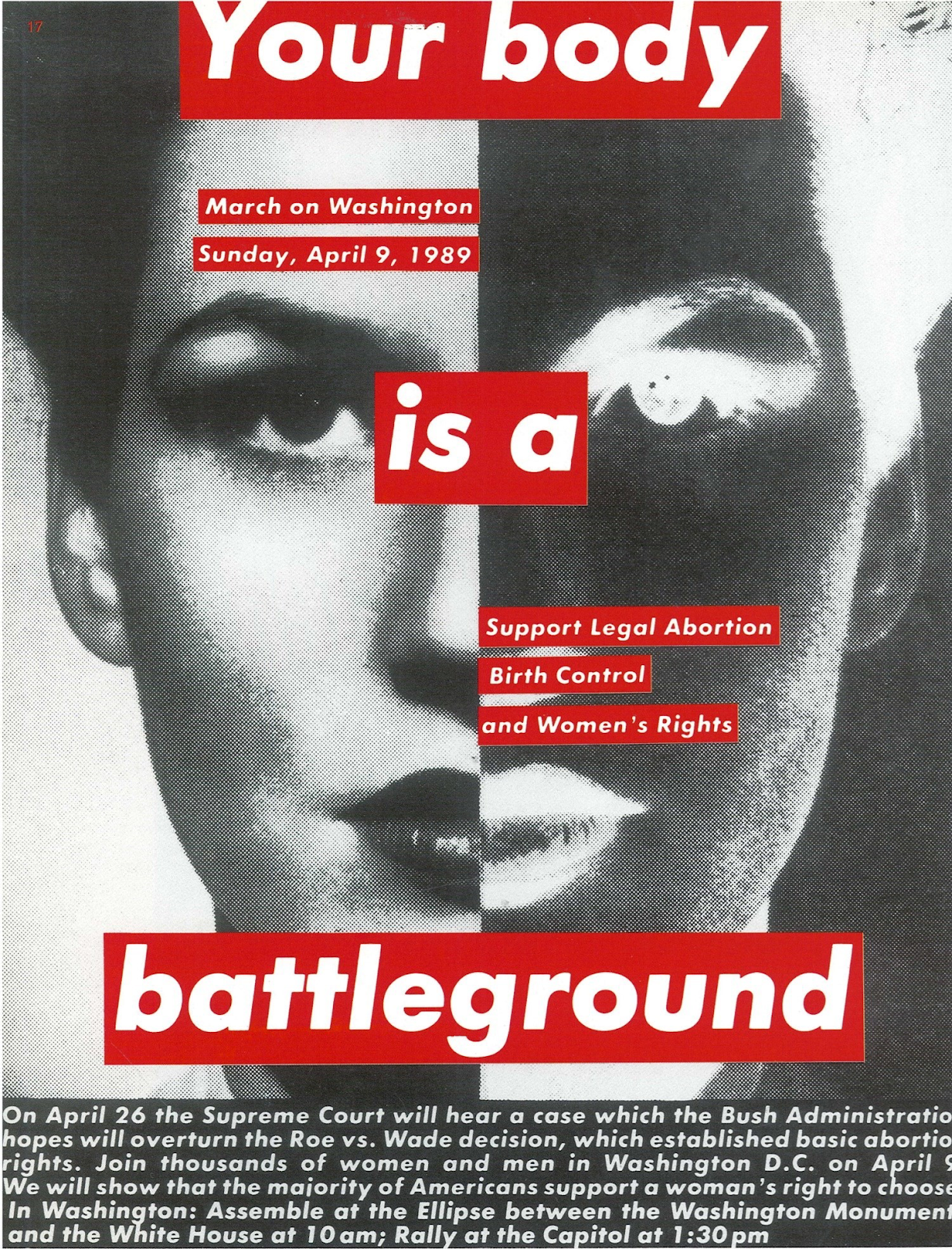
Barabar also uses her art to comment directly on events that have taken place, such as Roe v. Wade, as a call to action for the viewers.
By using pronouns such as 'you', 'me', and 'us', Barbara forces the viewer to acknowledge her art
and think deeper into the meaning and the message. It puts the viewer directly into the art and the moment.
We, the viewer, and the context of which we are in, the subject of her artwork.

Sources:
https://www.thebroad.org/art/barbara-kruger
Barbara Kruger - MoMAhttps://www.moma.org › Artists
Home - Barbara Kruger - Photograph Collage, Advertising ...http://www.barbarakruger.com
Barbara Kruger | icaboston.orghttps://www.icaboston.org › exhibitions › barbara-kruger
https://www.guggenheim.org/artwork/artist/barbara-kruger
https://wearembc.com/why-the-1960s-was-the-start-of-the-golden-age-of-advertising/
I also saw Barbara Kruger's exhibit when it was at the Art Institute! I really enjoyed the collage style of the pieces and the stark contrast of the black and white images with the red outlined text. I remember thinking how the white text with the red background really reminded me of the Supreme logo. I looked it up and the Supreme logo is also in the font Futura Bold. Supreme was founded in 1994 so obviously, Kruger's work came first. It is very interesting that much of Kruger's work criticizes consumerism and yet, whether intentionally or by accident, a major brand used the same style we see in her pieces.
ReplyDeleteI'm not familiar with her work but after seeing it here I really love her style -- it feels almost like it's out of a zine. The font reminds me of that one Instagram stories font, which in my opinion sort of adds another layer to the artwork. For a lot of people right now, social media is deeply engrained with the concept of identity, which is a theme you mentioned in Kruger's work. It also makes me think of the "trickle down" phenomenon that happens with a lot of art -- after it's created it's eventually commodified and widespread until it becomes really common, and what was once Kruger's unique art style can now be replicated by anyone with Instagram on their phone.
ReplyDeleteI really enjoyed Kruger's exhibit, especially when I got to experience it both in the Art Institute and the MoMA. One thing that I struggled with however, is her the existence of her anti-consumerism artwork in a museum that charges admission. This phenomenon is one that is much larger than Kruger; the issue of producing anti-consumerist art in a society that requires you to make a living by contributing to capitalism and thus consumerism is a convoluted and practically inescapable cycle. I often wonder if there is truly a way to escape this cycle or if we must simply do the best we can. However, when it gets to the point where your artwork is famous enough to be in a museum as large and profitable as the MoMA, I begin to wonder just how true the intentions are. Regardless, experiencing an exhibit that preaches anti-consumerism but is at the same time existing through a cycle of consuemrism, which then profits even further off of a gift shop, makes me feel somewhat uncomfortable. Nonetheless, it was a fascinating exhibit and I am glad that I was able to see it a multitude of times.
ReplyDelete